SNE: Choosing a Cover Recipe
A few notes on choosing the cover for my next book, Super Natural Every Day.

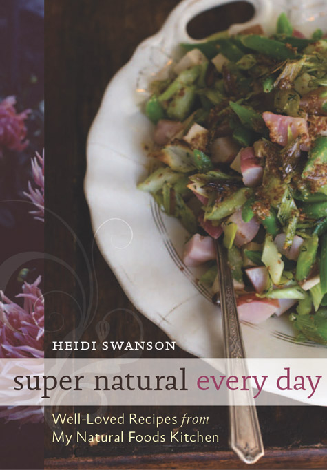
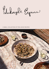
I thought I might loop you all back into the realm of Super Natural Every Day, to share a bit more of the play-by-play that goes into the making of a cookbook like this one. In case you missed previous (related) entries, I wrote this to kick off the series, then this one about how I approach the manuscript. Today I thought I'd share a bit about choosing a cover. It looks like we have a cover design that (fingers-crossed!) I hope you like as much as I do, and I'm excited to share some of the thoughts that went into it. Here it is:
I should start by saying, the path from having an idea for a book to holding the book in your hands is (in many cases) long and surprisingly non-linear. For example, I'm deep into the manuscript and photography for Super Natural Every Day, but not finished. At the same time, we're deciding on a cover. The cover seems to be one of the first things that needs to be nailed down. It appears in all sorts of places long before the book goes to the printer - for example, the publisher's catalog, on the pages of online book stores (for pre-orders), etc. It's the face of the book, and if done well, should set the tone for what you'll find inside.
I'm sure I've mentioned this before, but I feel very fortunate to be working with Toni Tajima at Ten Speed Press on the book design for Super Natural Every Day. Toni was my designer on Super Natural Cooking, and having her on that project was a stroke of good fortune I'll forever be grateful for. Being able to work on the follow-up with her? I've been out-of-my-mind excited about it. Toni heads up the design on the entire book - cover, interior, fonts, spreads - the whole nine.
So, let's talk about the function of a cover. They're quite complicated. Practically speaking, they have jobs to do. They need to communicate the premise of the book. They can set the aesthetic tone for the pages to follow. They need to look good life-sized, and as thumbnail icons. In my case, this cover had to differentiate itself from the last book at a glance, yet look related. As far as working with your publisher goes, you want to have buy-in from the people in the departments who support your book as well - the list is long (and important), and includes sales people, marketing people, as well as editorial. It's a collaboration, and the trick is creating and choosing something you love that doesn't fall into the design-by-committee trap.
Toni did a bunch of different mock-ups for this cover, and I fell for the one up above the minute she display it on her screen. All the other stuff aside, it felt right to me, hit the right tone. It's pretty, feminine, quiet with a couple understated flourishes. I liked the restrained color palette, and the font treatments. It has the dahlias I love to visit in Golden Gate Park in late summer, and one of my favorite recipes from the book pictured (a special potato salad). It's the kind of book I would pick up at a glance. This was one of the last comps she shared with us after sending other versions in the previous weeks. There were six or seven of us huddled around her desk when she showed it, and everyone seemed to light up.

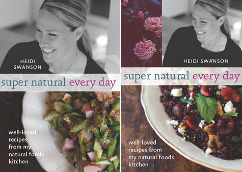
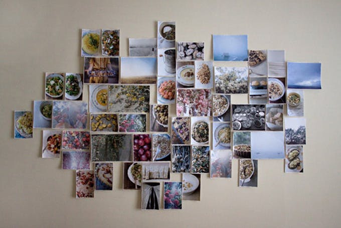
Here are a couple earlier versions (above) - two alternate favorites of mine. I like the softness of both, and again, the limited color palette. I'm not much of a shouter, part of the reason I think these quieter covers resonate with me.
As I mentioned up above, we talked a lot about how Super Natural Cooking and Super Natural Every Day should look different, yet related. One thing that will help, in addition to the actual cover design, is the trim size of the actual book. The new book will be the same as SNC, but with more pages. It'll be thicker. But if all goes well, you'll be able to tell they're sister titles.
And here we have a couple more me-centric (and, I'd argue, more commercial) covers. I think everyone agreed they're too close to the SNC cover. Also, while I might be on the covers here, they didn't really feel like me, if that makes any sense. Let's just say, I'm happy to make my exit from the cover to relax on a few of the inside pages ;)....
So, that's where things stand on the book front. I'm sure it won't be long before I'm able to share some spreads with you, or a glimpse at the recipe pages, or any other aspect of the creative process you might be interested in. We're working toward sending it to the printer this November(!)...which seems so far off, but really isn't. And lastly, I know some of you feel short-changed when I don't have a recipe to share, so I went back into the archives and cherry-picked two favorites to remind you of - I hope that will hold you over for a few days. xo -h
This Carrot, Dill & White Bean Salad is one of my favorites: Warm, coin-shaped slices of pan-fried carrots, white alubia beans, and chopped dill tossed with a tangy-sweet lemon shallot dressing. And it has been some time since I posted a sandwich, maybe because none are as good as this TLT, if cherry tomatoes have started turning up in your markets, give it a go.
Premium Ad-Free membership includes:
-Ad-free content
-Print-friendly recipes
-Spice / Herb / Flower / Zest recipe collection PDF
-Weeknight Express recipe collection PDF
-Surprise bonuses throughout the year
Comments are closed.
Apologies, comments are closed.
Comments
I think the cover with you standing in a field is the most beautiful one. It matches your photographic side best and is a bit more personal. All the cookbooks that are already out there have a food plate on the cover, and even though the salad looks amazing, I think the other cover stands out a bit more.
Don’t get me wrong, they’re all really nice, but I would definitely pick the b&w with you on it (by the way, you look beautiful on it)!
The cover looks nice all-in-all, with a great balance of color and a refined yet rustic and approachable feel, but i second the other comments not to italicize the “from”. Think about how weird it would sound to read it, “well-loved recipes FROM my natural foods kitchen”. as opposed to what, _to_ the kitchen?
Hi Heidi,
Your recipes have inspired me– from when I was a vegan to now when I am an omnivore again, I always found something tasty I could make from your wholesome recipes. If you ever need any people to test out the recipes in your new cookbook, I would sincerely be interested in devoting my time to such a good cause! Please let me know! Where did you get your inspiration for whole foods from coming from an American background?
wonderful! it looks inviting… i’d definately pick it up!
Hi Heidi,
I love your blog, and Super Natural Cooking, and I look forward to your second book- the cover is beautiful!
My one comment (I guess it’s a complaint, really) is that the binding on Super Natural Cooking seems to be really poorly done. I’m not sure if you’ve had this comment before, but I bought a copy both for myself, and as a present for my sister, and in both cases, when you turn the pages they come apart so far that you can see the glue and everything else that is (barely) holding the book together, especially at the beginning and ending of the book. My back cover is barely attached to spine of the book at all anymore.
I’m sure you’re like me, that while you’re cooking you like to have the cookbook open on the counter, referencing the recipe and flipping pages. Unfortunately, with your book, I’m sometime hesitant to even open it, because I’m worried pages are going to start falling out.
Of course, this isn’t a reflection on you at all, or your amazing recipes, but I thought I should send the comment along in the hopes that it will be fixed for the second book.
As a graphic artist, I would like to share with you a couple of options that either you might like them or you might not.
I love the photos that you share with your delicious dishes weekly. You should have one of those photos on the cover instead of having a sister book like Giada’s or Barefoot contessa. You should be unique and not have a similar look of their books. I believe that uniqueness, richness of the photograph and softness of the images makes the book special and wanted by all your readers. I will be best not to have you on the cover like most of the Foodnetwork cookbooks that you see out there. A simple cover says a lot when you have a rich photograph of one of your favorite dishes made with beautiful ingredients that can be next to the dish. A couple of dishes together over a rough surface can also do the trick. Your beautiful cookies, you have so much! You should be in a few pages inside the book for sure, but forget the cover. Be unique and just don’t be like another Sandra Lee. It is just my opinion.
Like the design elements, but not the photo and meal choice. You post beautiful photos on your site that send the message “make this now” but for some reason this one doesn’t do that for me. B&W field photo and apron feel dated and your dishes send contemporary vibe normally.
Good luck and continued success.
My only comment would be to maybe capitalize Super Natural, but not every day.
Also, why “well-loved?” Could they essentially be ‘favorites?’
Otherwise I absolutely love the color/design similar to your previous book. I’d buy it !
Just to say that reading about the cover for your next cookbook was so interesting. I really like the one you chose–definitely a book I would pick up even if I didn’t read your blog.
Also thank you for the recipes. I didn’t know until I saw them there that I was glad not have to go without..
What a difficult job! As you can see by the comments each cover is receiving multiple reactions and suggestions. My response is that I would love to see you on the cover as before. I enjoy seeing an author that is healthy and vibrant and that gives me yet another reason to invest in another cookbook. I prefer the final cover, the dish looks more interesting than just chopped veggies, I prefer the gold rim on the plate and the simpler text against the darker background is perfect! Congrat’s I will be buying whichever cover is decided on! Thanks also for a fabulous website!
Beautiful cover–the colors are soft; the picture inviting. Great choice! Thanks for sharing it.
I love the cover! You can count on your fans to find your book, and this beauty will grab new devotees.
Beautiful and is definitely a book I would pick up as it show cases food the way I like to eat and make it. If I may add a note. Your first book is great but I have to say that it is very difficult to lay it flat (open) when you cook from it.. This may seem small but is actually one of the important small details that add to an overall ease of use. I hope this is corrected in the new book.
Just beautiful, Heidi. All of them — what a team you two make.
I love the cover you chose. Yeah the pink potatoes look like ham but I don’t think that’s a huge problem. I like the interplay of the pink and green. I also like the subtitle for that cover better than “recipes for a natural foods kitchen” – it’s more personal. My only other thing I feel the need to chime in on is that I really don’t like the apron cover. It’s too “chopped” if that makes any sense.
Thanks for all that you do and sharing the process of your new book. I’ll buy it no matter what it looks like!
There are cookbooks that are written by chefs that have become culinary bibles both in commercial kitchens and in the home. In a crowded cookbook market we really need your book to have an original cover and contain first version (and exciting) recipes. I honestly feel that your cookbok will become a must have cookbook for many, no doubt about it. The recipes I have seen on your website are nothing short of brilliant. Please add a knife and fork (antique pearl handled) to the plate. This in my humble opinion would finish off the cover very nicely. I’ll be reading yours over and over.
Frank
The cover and photographs are the perfect visual of your title. I see the bounty of the earth, your smile, the beautifully presented prepared dish on the front, the simple apron, fabric and texture, and colorful vegetables on the back all of which express the theme of your book so well. I identify with all of it ! If I were seeing the book for the first time on a shelf or table in a book store, I would definitely pick it up & peruse! Well done! No pun intended!
I love the cover with an apron
Thanks for the book tip . Looks interesting.
Heidi,
Your choice is stunning! I love the color it gives a subtle fresh feeling. Great job! I am waiting to see it rock the shelves!
Heidi the cover is very attractive just like your recipes
Oh my, I didn’t realize the first cover looked like ham, but it totally does! I think the only reason I didn’t think so when I first saw it was because I knew in the back of my mind it wouldn’t be. But, someone unfamiliar with your recipes might take a glance at that cover and assume it was meat.
I looked back. It wasn’t a Beach, It was in the path through the tall grasses, I love that one. Say’s Natural to me.
I love the cover, it is beautiful! BUT, I also like the one of you on the Beach. You have to decide. Either way way it will be good because of what is INSIDE!
The cover you choose looks more complete in the sense that others look like two (beautiful) images put together. I like something about the one with you standing in the field and the other with the apron though. “Well loved recipes from my natural foods kitchen” I like more than “Recipes from a natural…”
Congratulations!
Great job! Heidi, would you tell us what is the dish in the second Heidi-centered cover? It looks stunning.
Stunning! Has the very desirable rustic cum wholesome health look to it…
Lovely!
Heidi- WOW! I am so excited for you about how this new book is coming along! I cannot wait to have another Heidi Swanson book on my bookshelf! Also, I actually liked the apron cover a lot, but the new cover also looks phenomenal! All great choices to choose from!
Either way, I’m sure any decisions that you make will be awesome! Congratulations on all of the progress!
Have a great weekend!
Thank you all for your thoughts and feedback. I have to say, it never even remotely occurred to me that those pink potatoes might be perceived as ham. Cubed ham at that. Nice.
I’ll circle back with Toni and all, see what they think. It’s certainly worth a conversation. I think one of the reasons we didn’t build on the apron cover idea was that it looked washed out on one of the monitors in an early meeting, so it didn’t get much love. But it was always high-up on my list of covers I was excited about. I’m glad to hear some of you liked it as well.
Hope you all enjoy your weekend. -h
the first cover is beautiful. At first I was stunned, I thought Oh No what are chunks of ham doing in this dish and I was so dissapointed. I wondered what others would think of this turn of events – meat! Thank goodness it’s just my aging eyes. My favorite is the last one only because it doesn’t look like meat. As soon as we can order your book it’s mine. Thanks for all you do.
Hi Heide, I have to agree with a few of the dissenters – the first cover isn’t my favourite either. I think it mostly has to do with the salad. I also think it looks like ham. Have you tried the salad from the last photo subbed in on the first cover?
Whenever I open your cookbook journal and see your fabulous photos and to-die-for recipes, I end up wanting to cook every recipe you post. You are so creative and extraordinary, and I cannot wait for your next cookbook.
In the meantime, I will just have to drool over these beautiful covers, and your recipe archives.
I would pick the last one. Only because I think your beautiful face should be on the cover. But your choice is very tasteful (and tasty :), just like everything that you do. Love!
I really like the cover, but I must say my favorite one is the one with the apron on the front. Regardless, I’ll be buying the book. I’ve tried quite a few of your recipes (probably 15 or so) on this site, and all but 2 of them have become favorites that I make over and over again. You really make healthy eating taste great.
Hi Heidi
This morning it’s raining and greige in Melbourne Australia. Have just read your ‘book cover’ post and my first reaction was: “Ooooohh. Red, orange, yellow, purple; warm tones. Go for warm tones!” Evolutionary psychology says they stimulate us, and our appetite and right now i feel it.
I’d favor same design with a more stimulting food visual. Depends on your goals: Is it important to satisfy your creative desires or, are sales more important?
Thanks for your great work. Will be looking for the new book – whatever the cover.
Kind regards Diana
It’s beautiful! I love the colors and the dish looks scrumptious. Thank you for sharing the behind-the-scenes. I can’t wait to buy it!!
Heidi, love your e-column and recipes. I think the proposed dish is confusing – cannot tell what it is. I think the dish that has more color is more interesting and frankly prettier. For me at least, I would be intrigued with the later photo. The other one – not so much. I would have never guessed it was potato salad, and am I not vegetarian (but my daughter is) – but based on the other contents about the potatos looking like ham – RUN!…..Also I like the one with you on the cover walking in the field and the apron. I also think the first cover is a bit busy. Please take comments in the spirit given. 🙂
I love the one you picked–it features the food in the best way possible. I agree with Paige and others that the italicized word “from” calls attention to itself, and I would suggest not initial capping that subtitle phrase. There are three different type treatments in a small space, but type is a challenge to get perfect. I love the scrollwork myself but I am wondering when it is going to run its course as a design trend.
The overall design is tasteful, sensual and intriguing and makes me want to flip to that recipe! P.S. In the last two weeks I have made your asparagus and tofu stir fry and the rosemary olive oil cake. Your recipes are the best! Thank you for sharing your passion.
Although I prefer brighter colors, the cover is very attractive and since you’re “not a shouter” it’s perfect! 🙂 That carrot, dill and white bean salad is one of my faves from your site as well–thank you for reminding me of it b/c I need to make it again!
agreeing with the comments about italicizing ‘from’ on the subtitle. It intonates in my head very strange.
the food you’ve chosen as the cover photo however… I’ll just jump into your server and snag a couple bites (bytes?) of that for a snack 😛
Love the cover design! Definitely the best choice. My only nitpick is the use of italics on the word “from.”
Beautiful illustrations! No matter what you choose, it will be beautiful. But I’m afraid that I, too, must add a gentle voice of dissent: I think that I slightly prefer the apron picture to the current picture. The current title page is, well, busy. I think you’re right: by featuring your face, it makes the book seem like a celebrity cookbook. But I love the soft, feminine flourish of the apron, the way it makes the book feel more sophisticated and well-loved — just like your recipes. It also downplays the potatoes, masking the way that they resemble ham.
No matter what, though, I know I’ll be purchasing this book. Just adding my voice to the (already deafening) crowd! The book will beautiful; at this point, people like me are just nit-picking.
Heidi: Another dissenting voice. My first impression of the cover was that the food looked too dark and too “busy”. I personally prefer the apron version if you must have that illustration on the cover. And I would drop the italicized ‘from’. It just doesn’t mean anything.
On another note, why is there meat in the dish? As a vegetarian I wouldn’t even look inside the book in a bookshop. I would be my loss, but… The flower colour and the (is it) ham colour are so similar that you just can’t miss the meat!
And a request. Please ask TenSpeedPress to improve the binding glue. The signatures in my copy of Super Natural Cooking are holding together, but the cover is separating.
Cavils aside, as soon as the book is available I will buy it! Too dark food illustration, presence of meat, separating cover–who cares when your recipes are so glorious?
instead of bl/w field, how about your hand tossing herbs from a sepia garden over the square photos of dish???
I actually prefer the covers that have your picture on them – would like to see a version between the last 2 examples. The cover you selected is very nice – I’d like to see your picture on it, though!
All I can say is wow…what a tasteful inviting cover! None of the choices are bad, but this one is perfect! (the apron is my 2nd choice)
I like that your name is in smaller type than the title. And I think all the “concern” over “from” is silly. It’s your book-do what you & your editor feel works! Really looking forward to the release.
Is the top picture I see your new cover? You have a very talented designer helping you. Of all the pictures for a cover you have posted, I like the top one the best. The covers featuring you are very nice, but is the point that YOU are presenting these recipes or the recipes themselves? Will people be buying the book because it’s YOUR book (ala Martha Stewart) or because it’s your recipes? I, myself, am not inspired to buy books by celebrities, but the contents of said book. Bottom line: what will sell the most books. Your recipes are excellent, so it comes down to what is most visually appealing to your audience.
Best Wishes,
Terro
Heidi — I may be the only dissenting voice here so far, but one observation which truly is not meant to be unkind is that the food in the cover you have chosen looks a bit old and dark, especially towards the top of the plate where it’s almost entirely in shadow. Compare that to the food color in the lowest photo on the right (I know it’s a different dish) and also to the fresh green of the peas on the cover of your previous book. Those are much brighter. Having seen so many of your beautiful photos over the years, I think you might have chosen a more original-looking dish. This one looks like chopped, sauteed vegetables — not too inventive. I think you have a unique talent and gift with food, writing and photography, and I’m not sure this dish represents you as well as you deserve. But if I had to choose a cover which includes this dish; then the one with the apron seems the most interesting. But again, I would vote for featuring a dish/photo which is both beautiful and stunningly simple; and to me, this is not it. I hope you take this in the spirit it is given; I don’t mean to be harsh.
I would recognize this as your book even without your name on the cover. Very lovely. Good luck as this moves forward.
Excellent choice–subtle but full color impact. and imminently “readable” at first glance. Congratulations!!
Heidi,
Thank you SOOO much for sharing the cookbook writing process. I daydream, quite often, of writing my own cookbook. As a twenty something trying to follow a still-developing-career path myself, I have not had the time and energy to invest in cookbook writing, but I heartily eat up all you have shared on this adventure! I find these posts just as interesting as the recipes!
THANK YOU!
~Alice Louise
Nice choice of cover. One comment…the high shine on the topmost food bits give the impression of greasiness. However, that could be minimized by a gloss varnish on the upper right and lower right portions of the image, and a dull varnish on the remainder of the cover. Just a thought. FANTASTIC GF recipes!!!
i like the cover with the apron . it looks so simple and organic just like your recipes.
The new cover is awesome! The swirl, colour and style immediately caught my eye (as did the stunning photograph) and added a level of intrigue that really makes me want to pick it up and look inside! CAN’T WAIT!
Love the flowers and graphics but I’ve got to say that recipe just doesn’t look very appetising. I’m sorry but I really have to be honest with you. If I didn’t know your site I would not buy this book based on the look of that recipe on the cover.
I think your choice is the right one, Heidi. It is absolutely beautiful and very inviting. If I picked this book up, I’d probably buy it.
It’s so fascinating to learn about this process! Thanks for sharing some peeks behind the scenes.
I never knew that I had a passion for cooking until I found 101cookbooks! I prepared an entire Thanksgiving using your recipes. I just made corn, coconut and curry soup form COOK 1.0 and Seed Crusted Amaranth Biscuits from SNC. I can’t wait for the new book! My family loves you because you sparked my adoration for the kitchen, which makes us all very happy and full! We have ongoing jokes about how awesome Heidi is:) Thank you for being you!
stunning! your photos are all really beautiful and your recipes so creative, simple and delicious. i can’t wait for this! thank you for letting the world preview your work in progress and allow us our two cents…that being said, i too thought the pink was ham, which gave this girl the shivers at first…so glad to read it is potato!
I really like the cover selected but have just one nit to pick: why is the “from” in italics? It seems to give it an unnecessary emphasis. I said it was a nit.
Love your top pick, but the alternate one of you in the field is also gorgeous (without the commercial factor). Good luck with the rest of the writing!! I’m sure it will be fabulous…
i like them all but like the one with plate and apron it very pretty. they will all turn out great whichever you choose.
i love your site 🙂
I love the cover but can i make a pitch for the one with the apron? Even though the cover you’ve chosen is laid out really differently than the first book, when i first glanced at it i DID think it was the first book. The feel is just so similar. The apron cover however is so nifty and subtle and although it matches the tone it is different enough….. okay, you get my point. You can ignore me. The cover you’ve chosen is great. and p.s. i get the italicized “from” and like it.
Beautiful! I liked two lasts with your picture.
Good luck, Heidi! Thank you for all the sharing you do.
Anna
Lovely….what is the recipe on the cover, it looks like something I want for lunch.
I, too, love the top cover. One question however: why the choice of italicized font for the “from”? It actually stuck out a bit for me, and I’m not certain that (again, personally) “from” is the word I would want to have stand out. Still, minutiae like that aside, it is a lovely cover, and the color palate is both soothing and inspiring (if that juxtaposition is possible).
I would be happy to test a few recipes!!
Jennifer
Heidi – I love the cover you chose. I imagine taking a bite of the salad. The vintage fork and delicate plate seem to reflect your sensibilities, along with the scrollwork, colors and font. I’m going to pre-order at Amazon now (if that is possible).
The cover you chose is fabulous!! It will jump off the shelves and into everyone’s arms! 🙂
As an editor, I think you made the right choice, although I would argue for not having “from” italicized.
Can’t wait to see the book in print~!
Gorgeous, stunning. Love the dahlias too. The beautiful photographs provide a wonderful challenge to any preconceived ideas that natural food and grains are solid fare. The cover alone makes you want to dive into the book. Hopefully we won’t have to wait too long! (?)
congratulations on successfully combining your flair for natural foods and the sophistication of your artistic eye! i love watching the journey!
I wish you the best of luck. The people who do estate sales say if their are many books, the most read is Cook Books. Other books appear to never been opened or read. The cook books have notes made in them and other things changed.
I look foreword to seeing yours.
I love your cover choice. It is beautiful, and looks representative of you and your cooking. Good luck with the rest of the process! I can’t wait for the book.
LOVE the simplicity of the cover. So subtle yet very inviting. I also like the cover with the “natural” apron tied… Whichever one you choose – will be a winner! I do have to agree – the 2 with your picture at the top reminds me too much of your previous book. Unless you want that “look” to be your trademark – which could be fun and whimsical as you continue into the future. Love all your recipes…
Best of Everything!!!
Love the one you choose!! It would have been my pick too. It’s gorgeous 🙂
I love all the covers and can’t wait for the book to come out, no matter which cover you choose!
Beautiful–can’t wait for the cookbook! Thanks for sharing the process!
Love the book cover and I love that I have recently discovered you and your recipes! Your book is going on my “wish list!”
I think that it is a great design, it is a cookbook that I would buy from seeing the cover alone, though what is inside is surely to be inspired! The spoon is subtly inviting as well…
I really like the cover! It “feels” right with my experience of your previous book and this website.
If it isn’t too late, could I suggest, nay beg piteously – that you please please please do NOT have the text be teeny and light green on medium green backgrounds – or white text on orange backgrounds. A certain celebrity chef has a cookbook out that is quite pretty to look at, but utterly unusable. The font is microscopic and at least half the pages have light text on a medium background. I’m not THAT old and I can’t read it, and I can’t even get it to photocopy so that it is usable.
I want to cook things from your cookbook, not just look at it – so please don’t let them talk you into pretty layout at the expense of read-ability.
Best wishes,
Leigh
PS I thought it was funny that I was in SF while you were visiting Portland, OR where I live. LOL!
It occurs to me that that is a new recipe (duh) and I will have to buy the cookbook to find out about it. Which I will! I love the recipes on this site and come back often. Many of your recipes have gone into regular rotation in our house.
I don’t know how you chose between each of the cover options…they all look beautiful to me! And every single one of them has me yearning to get my hands on the new book. 🙂
P.S. Carrot-Dill-White Bean salad is an absolute favorite of mine. Just made it last night!
Heidi,
I am working on my 2nd cookbook as well, for Tuttle Publishing, to be published Fall 2011. This one is tentatively titled My Japanese Kitchen. My first book THe Korean Table I co-authored. I am facing the same deadlines — photo shoot in 2 weeks and manuscript at the end of the summer. Yikes.
Your method and organizational technique I found very interesting — I do something similar with binder etc. I have created an excel list of recipes with about 5 columns next to the recipe where I make notes. Love your green light idea and may appropriate that. Would love to check in with you if you had a few moments. The outline sounds critical.
Debra
I love the cover that you selected, it’s very inviting. I have to ask-what dish is that in the photo at the very bottom on the right? I see what looks to be black or red rice, feta cheese, maybe walnuts and something red. Tomatoes? Fruit? It looks great!
i love the cover! but i am also a book designer and the italicized ‘from’ is weird. usually italics conveys emphasis– it makes the tag a strange read.
and would you ever put something about the recipes being vegetarian on the cover? i also thought the pink stuff might be ham. 😉
I can’t wait to see what cover you choose. For pictures of you, find ones that ‘feel’ like you. It is so odd to meet someone who’s personality doesn’t match their picture. If you think it looks like you, it probably matches your personality.
The cover looks great – can’t wait for the book(and everything inside!).
Very nice choice, but I too think the italicized “from” looks and sounds strange. I hear it in my mind as a sort of shouting emphasis.
Another thought I had is that “well-loved” can be a euphemism for used or second-hand. That doesn’t actually matter if you’re talking about recipes, but it’s an association I have.
I think it’s perfect! This is definitely has the same earthy and vibrant feel as Super Natural Cooking, but different enough to spark interest!
Best of luck, I can’t wait to purchase it!
I think it looks great. One thing though .. I can’t help wondering why ‘from’ is in italics. All lower case would be fine but I would ditch the italics. I’m picky that way. ;o)
Hi Heidi
I am a graphic designer, and the cover you chose is wonderful. However, I have one comment/question:
Why is the “from” highlighted/italicised? It is not what is important, and yet there it is!
Cheers, Madeleine
It’s beautiful, Heidi. I love the dahlia trim, and how it so very much echoes super natural cooking without mimicking it. Just lovely.
Gorgeous! I can’t wait to find a home for it in MY kitchen!
The one you chose is the best for sure. Second best is the one on the bottom left (with the big picture of your face).
I think the one with you walking looks melancholy.
I would look twice at that cover, it has eye appeal. Even if I was not familiar with your site I would find that cover enticing. It actually is more attractive than the first, though I am not sure what has upped the WOW factor. I do believe it is the singular focus on a well balanced plate and palatte.
I am an avid cookbook reader and have access to a store I am sure you are familiar with: Powell’s here in Portland. I have been in the Hawthorne store many times butit was not until after I read your site that I went and actually opened your first book. Multnomah County Library has since provided me a copy for a few weeks and now it is on my short list for purchase.
As others have said, thank you for sharing this side of a cookbook.
Oh, I am so glad you picked the food world as your passion. Your cover choice is delicious.
Also love the Apron. They are both so you.
I love Super Natural Cooking and I’m excited that you’re releasing another book. I didn’t know until now! When does it come out? The covers look gorgeous and I love the design of your previous book as well.
Beautiful, but those pink things looked like chunks of ham to me too!
Not that you needed my consent but yes, I totally agree with you. 100%. I love them all but the one you choose is more magical and enigmatic.
Oh, how exciting must be the whole process of writing a book. Thank you so much for sharing it with us your readers.
I like, that the one you chose is a bit different in layout than your first book.. the similar shades of colors connect it ..
maybe this is not appropriate to point this out, but the only thing that I noticed, that I wasn’t loving is how the p from super lines up with the hard edge of the black.. I am thinking, that maybe the serif of the p should line up, for a softer look.. just an intuition as well, but I am sure, you guys played around with those things before.. :)..
love your esthetic and imagery in general..
Beautiful design and photos for the covers.
I do have to say, though, that the photo of you looking away makes my eyes just zoom straight off the cover. I follow eye direction when I see faces, so the picture of you makes me look away from the cover.
Thanks for sharing – such interesting insights into how a book gets made!
such a beautiful cover! i could not be more excited about your new book. enjoy your weekend.
Ooh I think they’re lovely and agree with you about the muted palette. Great work! Can’t wait to add it to my collection.
love the insight you’re giving us! i wasn’t reading blogs much when your first book came out, so this is extra fun!
i really like the top picture; it’s muted, but snazzy , if that makes sense. i also like the bottom right pic with the bolder colors. can wait for more updates!
Heidi that’s wonderful!thank you for sharing this with us!
i agree with you and love your first choice for the cover of Super Natural Everyday although all the other options are also very beautiful.
more direct approach and a little different from your previuos book cover.
good luck to you all!can’t wait to buy a copy.
best,
P*
That cover is awesome, can’t wait to get my copy. Greetings from Finland too 🙂
Absolutely beautiful! I’m so excited for your new book! I made your Otsu from SNC last night for the 10th time–it hit the spot.
I hope to one day be in your shoes, picking out the cover of my cookbook, taking photos, etc. I feel like I have a good idea for a cookbook but I don’t know where to start. I really enjoy these updates!
Just lovely! I am so looking forward to this! I have made the TLT numerous times and it is a favorite. Will try the carrot salad!
although i do truly truly love the apron strings, your instincts were totally correct.
on a torrentially rainy day such as this, your site always makes my soul much sunnier!
Right choice. Definitely.
In print, a book with that lovely plate of food on the cover is something I’d probably buy on impulse (not sure the web quite does it justice).
But does anyone else think that the ‘from’ in italics does not seem quite right somehow?
Just love the plums, if the back cover is still undecided.
LOVE it!! looks appetizing, friendly, soft & genuine, one just wants to reach out & sift thru the pages contentedly…frankly, i really can’t wait for SNE to come out in print and be holding it in my happy hands! thanks so much for sharing the whole process with us, its rather fascinating – to me, at least… keep on with the super creativity! cheers!
Love these covers, and the one you chose. Although, I must admit, I love the apron tie on the second option.
I can’t wait until it’s finally in print!
Warmest wishes from my Madrid kitchen 🙂
i´m very excited for you and looking forward to my own copy. i like the cover with the apron best…
Can’t wait to see the finished product! Hope it’s gonna be available in Melbourne, Australia not too long after it’s out in the States. =) I suppose I can rely on Borders…
I can’t wait for this one. My favorite cover is the one where you are walking in a field. Thanks for sharing!
What a beautiful choice of cover!
As a library student I look at a lot of books and just wanted to add that I look forward to seeing a final product that easily sits open on the counter and is easy to read (no fancy fonts, please).
I love the version on the top most – if I didn’t know you, I would definitely buy the book by its cover alone.
as it is though, there’s an empty space the size of super natural every day in my cook book shelf right next to super natural cooking. (glad to hear it got the same style and size)
keep us updated, pls!
dear heidi,
so i’ve visited your site many times over the past few years and recently, while ending my law school student days, and beginning my bar study experience, decided to remove the new york times as my home page and make your blog the first thing i see when i open up my computer world.
i’ve been beyond inspired (and satisfied with my decision to change the kind and quality of info i take in) and made the pappardelle with asparagus (lightened the butter and doubled the greens) for my family on friday night of my graduation weekend-what a hit! we served it with oven roasted halibut (with olive oil, capers, golden tomatoes, shallots, garlic and basil) and a bottle of pinot grigio-molto buono!
tonight i decided to make the rosemary cakes and doubled the recipe, went along for the ride with the ap flour (contemplated using oat instead but decided would be too gummy.)
they are beautiful, flavourful, airy, chocolaty goodness.
thank you for your time and for your words, photos and recipes. i truly look forward to seeing how the book continues to develop.
you’ve got a genuine fan in texas.
if you ever roll through houston mi casa es tu casa para comer y disfrutar la vida!
i do love the first cover–simple, and a promise of the delicious meals to come from such a beautiful, uncompromised collection
The one you chose is my favorite. Simple, elegant and beautiful colors. Nicely done. Congrats!
All these covers looks great. It must have been very hard to choose.
Fabulous! Loved it on first sight! Best of the bunch — well designed and chosen.
Good choice! I like that one too. And the one with the apron.
Thanks for continuing to share the process of your upcoming book. It is a great education and insight to those of us who can only aspire to produce a cookbook one day.
(oops, it got cut off…) Heidi, I love the cover! Can’t wait for another fabulous cookbook heading our way soon!!
I can tell that Toni is very talented. These covers are beautiful and meet the criteria you set forth. I do have a favorite, and it’s the third one pictured. I just love the way the thin strands of the linen apron is tied together, it’s very feminine and rustic.
Heidi, I
Wow, that’s so exciting! I love the one you picked- it looks great!
I think the cover is very nice and suits your style, at least from what I can tell based on your last book and on your blog. I like the first one the best too.
I am dying to know what the cover picture is of, though. I think I see some asparagus… but what in the world is that pink stuff? I can’t get past the thought that it looks like chunks of ham, but of course you wouldn’t have ham in your book!
HS: Thanks Monica, it’s a special potato salad. 🙂
I love the first cover and like the third one but I’d make the bottom part narrower than the top one. Can’t wait to buy your new book!
Its looks beautiful. Took my breath away when I first saw it. Definately a good choice.
I’d buy it!
Beautiful! Can’t wait to get my hands on your new cookbook, I’m sure it will be every bit as nice (and nicer) than the first. Bravo!
I love the cover chosen, it looks attractive, quiet and earthy. SO exciting 🙂
I meant 1 and 2.
Beautiful. I can’t wait for your new cookbook. I love the 2 I have of yours. So many great recipes along with the many I find here on your blog. Thank you for sharing a sneak peak with us.
The cover is so beautiful. I remember how excited I was designing my own cover. It’s like the birth of a baby. The colors are gorgeous and the dish on the cover is so appetizing. I like #s 1 and 3 best.
It’s going to be a fantastic book.
Best of luck!
It’s so interesting to see what goes into the long and involved process of publishing a cookbook — you and your collaborators are very talented and inspirational!
I think it’s beautiful, though I don’t understand why “from” is italicized.
Just a kiss of flair amongst all those san-serif letters :)…
I love all the covers and can not wait for your book!!!
Heidi, it looks beautiful – love the colour palette…..thanks so much for sharing this book making process with us……..can’t wait to see the next instalment….
Beautiful. The cover you chose does feel the most like you (from my limited experience). I love the color palette too!
I made a version of your lemony chickpeas for lunch with farmstand kale and broccoli and thought a lot about simple, super fresh, and healthy cooking.
I can’t wait for the new book and will in the meantime keep myself satisfied with old favorites from the archives 🙂
Comments are closed.
Apologies, comments are closed.
More Recipes
Weekly recipes and inspirations.
Popular Ingredients